

In my life pre-Fynder, I’ve worked on numerous websites for big consumer brands, helping those brands get prospective clients to interact with their business how they wanted them to – trying and buying their products! I am putting this to good use as Fynder’s lead designer – I love spending time on our clients (and future clients) websites, checking out what works and what doesn’t, and coming up with new ideas about where and how the Fynder booking button fits best. So if you looking for the best place to put your booking button, look no further! I’ve outlined a few best practices below.
Before I dive in however, here’s a little background on Client Online Behaviour. If a prospective client or current client is on your website, you can assume: 1) They want to find out more about the business OR 2) They are a returning client who is looking for a class.
Your end goal for BOTH of these clients is for them to book a class!
So the question is – how do you make it super easy for those clients to book? Think about your Call-To-Action (CTA) buttons carefully! CTA’s are the buttons you use on your website to guide users towards the action you want them to take. In the case of Fynder and our booking widget on your website, the call to action is ‘Book Now’ or ‘View Our Schedule’; however you have chosen to word it on your website.
CTA Best Practices
- Visibility. Make the main CTA the most apparent element of the page. Keep the CTA either in the hero (top of the page) or within the navigation menu bar; in both of these cases the CTA is constantly visible and very easily accessible by clients. Fynder Tip: You can have your Fynder button on your website as many times as you like.
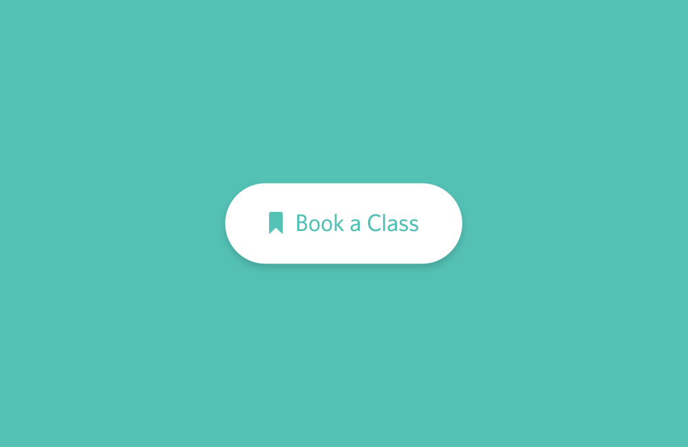
- Buttons are best! People are more likely to click something that looks like a button, rather than a link.
- Positioning. Centered, or to the right of the page. Due to pattern recognition and clicking behaviour, people are more likely to click a button in the centre, or on the right-hand side of a page
- Consistency in style. Your users learn the styling and behavioural patterns of your web styling. Keeping consistency makes it easier for them to learn how to book and manage through your website
- Colour. The appropriate colour is highly dependent on industry and user demographic. For example, in the food industry, red is used, as it is the colour for hunger. In banking, to maintain a level of trust, blue is used for trust and green for validation. The message here then is to make your button stand out on the page. Use your branded colours, and if you have a set demographic, tailor it to them.
Further Reading:
- 6 Characteristics of High-Converting CTA Buttons
- Call-to-Action Best Practices
- 17 Best Practices for Crazy-Effective Call-To-Action Buttons